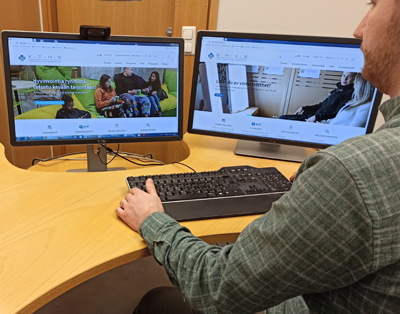
The new FSHS website is now up and running. The purpose was to make the site easy for all users to navigate, with the content organised into clear sections that are easy to find and understand.
The new website was created with users in mind. The website is often the student’s first contact with the FSHS. People visit the website to look for information and instructions on FSHS services and advice on their health problems. The purpose was to present this information more clearly and to provide better instructions on using the FSHS services. Several pages now contain icons to guide you forward on the service path. The most important information and services can also be found on the front page, where you can access appointment booking and online services, contact details of the service units, as well as health-related information.

Easily accessible in three languages
The new FSHS website is fully accessible in three languages. All permanent sections have been produced in Finnish, Swedish and English in accordance with the FSHS language strategy.
Accessibility has been taken into account in both technical development and content development. A student studying Finnish was involved in creating the content, with particular attention given to clear expression that would be easy to understand by users. The pages can now be used with screen-reading software and listened to in audio format. The font size can also be increased if necessary.
The website is currently being tested by Avaava Oy to ensure that it is accessible in terms of usability and the technology employed.
Nearly a one-year project
Work on rebuilding the website began in late spring 2019. Several working groups (from planning to testing) took part in the project, which lasted nearly a year. The working groups included student representatives, FSHS service experts, communications specialists and data protection experts. The groups analysed the old website and devised and tested service paths and data retrieval on the site, looking at why students visit the website, what they want to do there, and how to create a good service experience. These considerations formed the basis for the structure, graphics and key service paths on the new website.
Development work continues
Work continues to produce new content and to further develop the various functions. What do you think about the new FSHS website? Is it easy to use? Can you find all the information you need and can you find it easily where you expect? Did you spot any spelling mistakes? Browse the website and tell us what you think by email viestinta(at)yths.fi. Let’s together create the best possible service experience.
